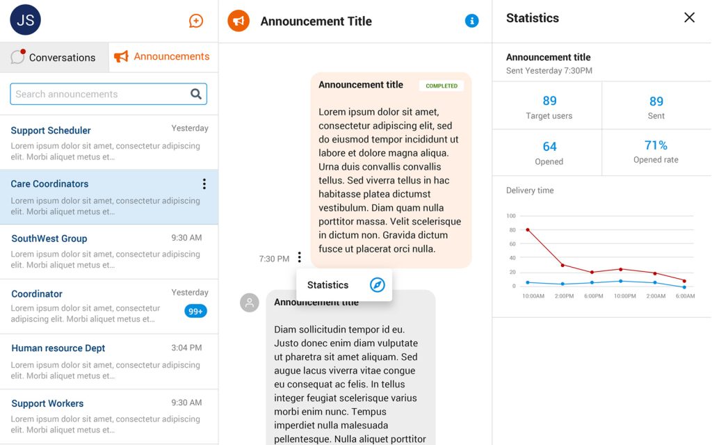
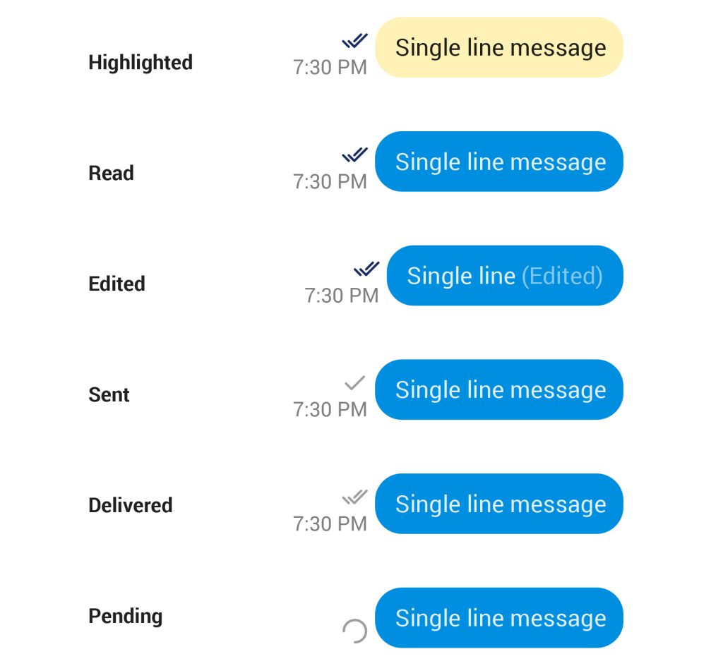
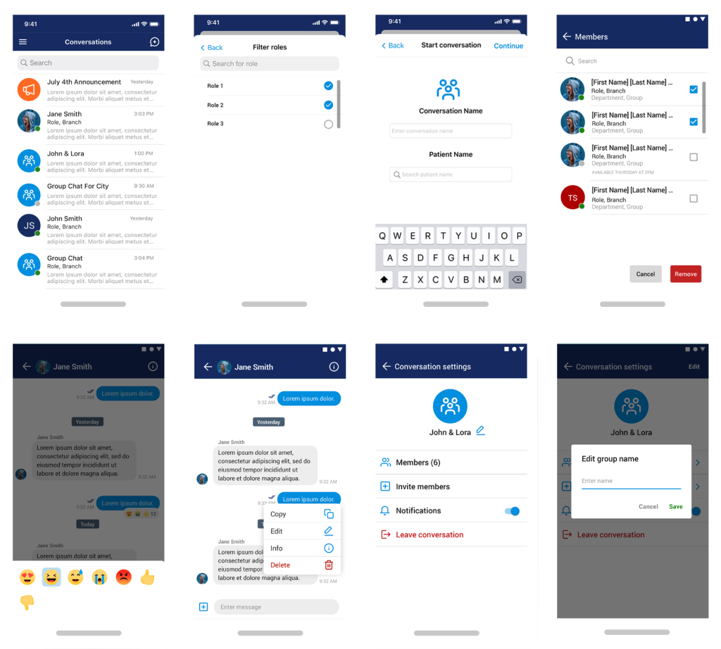
ALAYA CARE
Montréal, Québec, Canada
AlayaCare is a provider of revolutionary cloud-based home health care software.
OVERVIEW
In partnership with 333 Photo & Design and the Product Manager at Alaya Care, we introduced a new messaging app. My responsibilities included conceptualizing fresh designs from storyboards and presenting them to the team and Product Manager. Adhering to design consistency through an established design system, we crafted desktop and mobile versions for both IOS and Android platforms.
The UI design prioritized user efficiency and focused on enabling caretakers and patients to achieve their objectives swiftly and seamlessly. Our aim was to create a user-friendly and frictionless UI experience.
ROLE
UI Designer
INDUSTRY
Home-Based Care
SKILLS
UI DESIGN
TOOLS
SKETCH
ANNOUNCEMENTS
To improve team communication and ensure critical information reached everyone efficiently, I designed the announcements feature. A centralized space for sharing important updates, reminders, and changes with the entire caregiving team. This reduces the chances of missed messages or fragmented communication, ensuring everyone is on the same page.

MESSAGE STATES
In designing the messaging experience, I focused on creating a system that clearly communicates the status of each message at any given point. Since a message can go through various stages - such as sent, received, read, or archived - it was essential to design a structure that would visually and functionally reflect these states to users. Below is a list enumerating the potential states a message can occupy.

MOBILE DESIGN
With communication at the heart of the user experience, I focused on creating a clean and intuitive messaging interface that made it easy for users to stay connected and efficient across both iOS and Android platforms. The goal was to reduce friction in everyday interactions by prioritizing clarity, accessibility, and speed. The layout featured a simple, well-organized chat structure with clearly defined message bubbles, timestamps, and status indicators - ensuring users could quickly understand the flow of conversations at a glance. Navigation was thoughtfully streamlined, with easily accessible buttons for composing new messages, attaching files, and adjusting settings.
