Menu
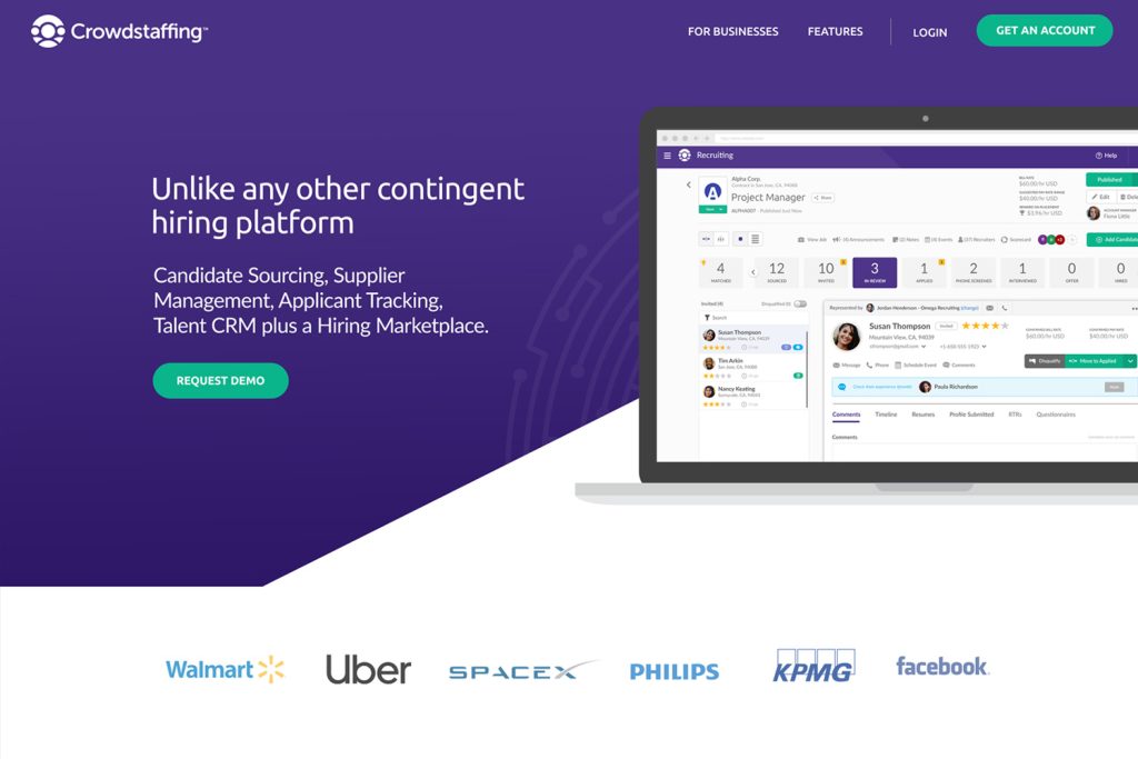
Crowdstaffing
I joined the project during a rebrand as the Product and Visual Designer for a hiring platform, streamlining fragmented workflows common in recruiting tools. I translated user needs and business goals into clear, intuitive interfaces, creating a cohesive experience across dashboards and job posting flows that made key tasks faster and easier for recruiters, employers, and candidates.
Role – Product Designer, Visual Design, Data-Rich Interfaces
Team – UX Designer and Chief Product Officer
Duration – 5 years
Tools – Adobe XD, Illustrator, Photoshop
Understanding the Problem
Recruiters, employers, and candidates were slowed down by fragmented workflows and unclear interfaces in existing hiring tools. Posting jobs, reviewing applications, and managing dashboards felt inefficient and time-consuming. The challenge was to redesign the platform to streamline tasks, create a consistent, intuitive experience, and enable faster, more confident hiring decisions.
Key Outcomes & Results
Streamlined workflows & enhanced user experience by reducing friction in key tasks like posting jobs, reviewing applications, and managing dashboards, making them faster and more intuitive while increasing user efficiency, satisfaction, and confidence through a consistent, polished interface.
Accelerated candidate review and hiring by simplifying key actions and reducing unnecessary steps, enabling users to review, shortlist, and hire candidates more efficiently while supporting faster, more confident decision-making.
Clear, structured workflows for faster use by organizing content and tasks into a logical, consistent structure, making the platform easier to navigate and enabling users to complete work more efficiently with less confusion.
Research Insights
Uncovering Friction in the Hiring Experience
I reviewed research from recruiter and candidate interviews, alongside observations of existing hiring workflows, to understand pain points across the platform. Job posting and application review involved too many steps, dashboards were cluttered, and candidates had difficulty tracking their progress. These insights guided the redesign, helping streamline job posting, simplify dashboards, and clarify application flows.
Aligning Product Decisions with User Motivations
I reviewed existing user personas for recruiters, hiring teams, and candidates to understand their needs and pain points. Recruiters faced multi-step job postings and cluttered dashboards, candidates dealt with long, inconsistent application flows, and employers struggled to compare candidates and track recruitment progress. These insights guided design decisions to create a smoother, more efficient hiring experience.
My Design Contributions
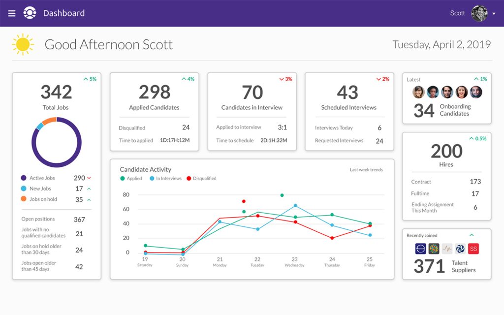
Redesigning the Hiring Manager Dashboard for Faster Insights
As part of a broader hiring platform rebrand, I led the redesign of the Hiring Manager Dashboard to improve how recruiting performance is understood at a glance. I restructured the experience to prioritize high-impact metrics, such as active jobs, applied candidates, interview volume, and scheduling activity, using clear visual hierarchy, consistent data visualization, and trend indicators to support faster decision-making.
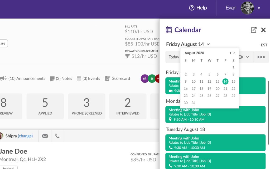
Simplifying Appointment Management for Recruiters
I was tasked with designing the Scheduler Module, a tool to help recruiters efficiently manage their availability and coordinate meetings with ease. I created an effortless and flexible user interface that allowed recruiters to set availability windows, view attendee details, and define appointment durations, resulting in a streamlined scheduling experience that reduced friction and enabled faster, more organized appointment management.
A Color Palette That Enhances Usability and Clarity
I created a new color palette that refreshed the brand and improved interface usability. Beyond aesthetics, I focused on accessibility, clarity, and visual harmony, choosing colors with strong contrast for readability and assigning tones that clearly guided users through actions and statuses.

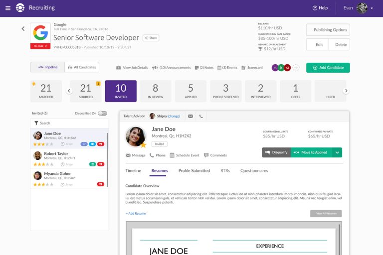
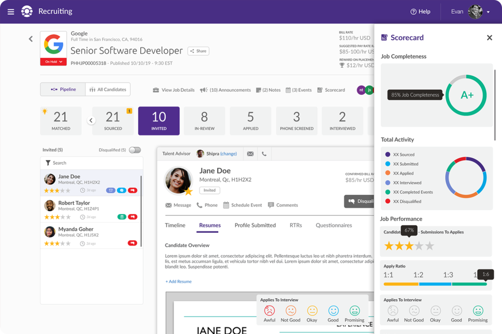
Optimizing the Candidate Profile for Clarity and Speed
The legacy Candidate Profile lacked clear hierarchy, making it time-consuming for recruiters to piece together candidate details, hiring status, and pipeline progression. As part of a platform-wide rebrand, I optimized the experience to prioritize essential information and clearly visualize progression through the hiring pipeline in a clean, scannable layout. A slide-in scorecard was introduced to give recruiters instant access to detailed candidate metrics without leaving the profile view. The result is a more intuitive profile that improves pipeline visibility and supports faster, more confident decision-making.
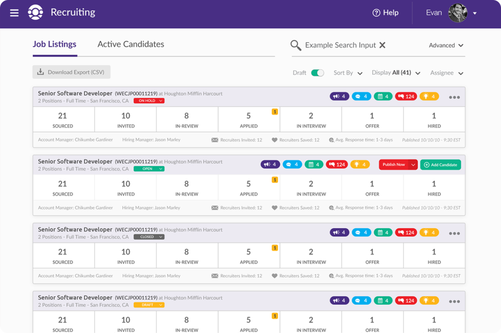
Streamlined Job Listings for Faster Recruitment Decisions
We addressed the lack of a central interface for recruiters to track open roles and quickly see candidate activity. Building on the existing experience, I improved the Job Listings page to highlight each role, surface candidate counts and hiring progress, and organize key information in a scannable layout. The result is a more intuitive, user-centered experience that helps recruiters prioritize roles, monitor pipeline progress, and make faster, more confident decisions.
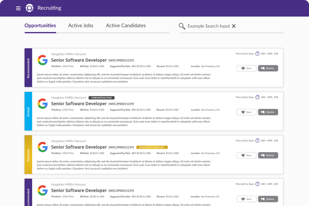
Making Job Openings Easy to Scan and Prioritize
Recruiters previously struggled to explore open roles and track candidate activity in a single, intuitive view, making it challenging to prioritize positions and manage pipelines efficiently. To address this, I restructured the Job Opportunities page, organizing listings with clear hierarchy, surfacing essential details such as role type, location, and active candidates. The result is a centralized, scannable interface that reduces cognitive load, empowers recruiters to prioritize openings quickly, and supports faster, more confident hiring decisions.
Designing High-Impact Landing Pages to Drive Conversions
I was responsible for designing high-impact landing pages that played a key role in Crowdstaffing’s digital marketing efforts. Each page was built with a clear goal in mind: drive conversions. Aligning design decisions with marketing objectives allowed me to create landing pages that were not only visually engaging but also highly effective in turning visitors into qualified leads.
Key Learnings
Joining the hiring platform project during its rebrand gave me the opportunity to tackle data-heavy dashboards and complex workflows from the ground up with a fresh perspective. Collaborating closely with another UX Designer and the Chief Product Officer, I translated user needs and business goals into clear, consistent, and intuitive interfaces for recruiters, employers, and candidates. From dashboards to job posting flows, I focused on presenting large amounts of information in a visually digestible way, streamlining key tasks, and ensuring the new visual identity was applied consistently across the platform.
Through this project, I deepened my ability to design for complex, data-heavy workflows, structure information for clarity, and integrate brand identity seamlessly into UX. I also strengthened my skills in cross-functional collaboration, user-centered iteration, and balancing usability with visual design to create interfaces that support fast, confident decision-making.
Angelo has been assigned to numerous accounts, one of which is Zenith Talent and their product; Crowdstaffing. He has been able to handle the interface designs for their product while extending their brand into new and different areas of the application.
Evan Shuster – Director of Design & Web at 333 Photo & Design