Greenway Health
I worked as a Product Designer on Greenway Health’s EHR platform, creating intuitive solutions to help healthcare providers manage patient records, clinical documentation, and workflows. I modernized complex experiences by translating user insights into clear interfaces, and collaborated with stakeholders to validate designs. My work streamlined critical tasks, reduced cognitive load, and improved overall efficiency and user experience.
Team – 5 Product Designers, 4 PMs, UX Research Team
Duration – 6 months
Tools – Figma, Axure, Jira

Key Outcomes & Results
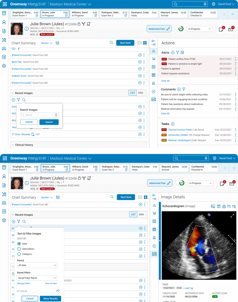
Streamlined Allergy Module for Efficient Data Entry
The Add Allergy module, used to record patient allergies and their severity, was cumbersome and hard to use. I simplified it by streamlining content and controls, reducing clicks, and improving the visual hierarchy, making it easier and faster for users to input data accurately.
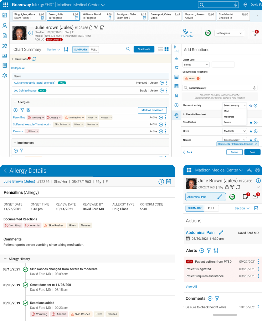
Streamlined Allergy Module for Efficient Data Entry
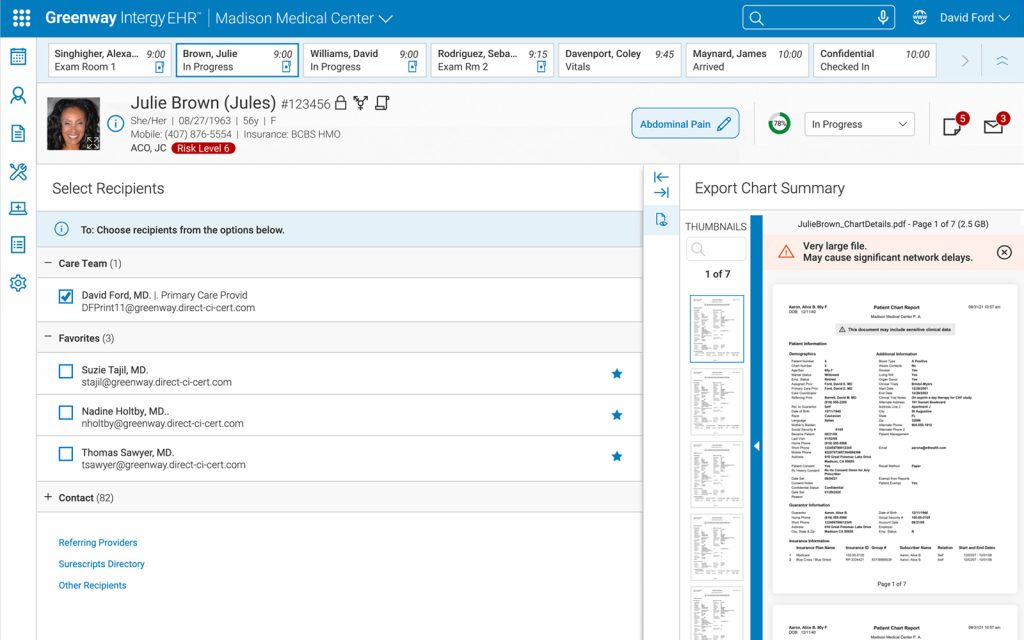
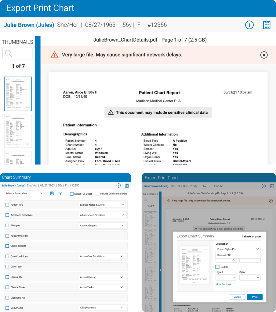
Users needed an easy way to view and export data visualizations, like charts and reports, into a printable format, but the existing system lacked a streamlined solution. To address this, I designed the print chart feature, creating an interface that lets users seamlessly generate and format charts for both physical and digital reports.
Key Learnings
I also grew a lot in translating complex clinical requirements into intuitive, actionable interfaces. Balancing rapid iteration with regulatory and technical constraints taught me to be flexible and thoughtful in my decisions. Overall, this project strengthened my skills in systems thinking, user-centered design, and designing for complex workflows, while reminding me how crucial collaboration, compliance, and continuous feedback are when building tools that people rely on every day.