Greenway Health
Role: Product Designer
Industry: Healthcare
Skills: Product Design, UI/UX Design, Responsive Design, Prototyping
Tools: Figma, Axure, Jira
Overview
Greenway Health’s legacy EHR was powerful but clunky and difficult for clinicians to navigate, making everyday tasks slower and more error-prone. As a Product Designer, I worked with a team of five designers and four PMs to modernize complex workflows and improve usability, translating clinical needs into clearer, more intuitive interfaces. I also regularly tested concepts with doctors and nurses to gather real-world feedback and ensure the designs truly worked in practice.
Business Goal
The goal was to modernize Intergy, Greenway Health’s cloud-based EHR and practice management platform, to better support doctors, clinicians, and staff. Improving outdated workflows and interfaces was essential to enhance usability, increase efficiency, and elevate the overall user experience.
Outcome
I collaborated with Greenway’s project manager and product owners to modernize Intergy’s user experience, refining key features, translating storyboards into design concepts, and delivering high-fidelity prototypes that aligned with user needs and supported agile development.
Reduced clicks on the allergy module by streamlining workflows so clinicians can complete tasks faster.
Enhanced clinician workflow by adding new features, including direct messaging and the ability to export charts.
Improved usability led to increased user satisfaction and positive feedback from clinicians.
Design Process
UX Research
I dug into research from the UX Research Team to really understand our main users, doctors, nurses, and clinical staff. It quickly became clear that they needed an EHR that actually supported how they work, not one that buried them in unnecessary steps. The old system overloaded them with cluttered screens and too many clicks to get even simple tasks done.
User Persona
Doctors, nurses, clinicians in a busy clinic.
Goals
• Complete documentation and tasks quickly with fewer clicks.
• Access key patient info fast without digging through screens.
• Stay focused on patient care instead of system navigation.
Pain Points
• Too many steps for simple, routine tasks.
• Cluttered screens that make it hard to find important information.
• Workflows that slow down doctors, nurses, and other clinicians during busy clinic hours
Behaviours
• Jump quickly between patient charts, lab results, and notes to keep up with a busy day.
• Lean on shortcuts and past experience with the system to save time.
• Appreciate tools that work with their workflow instead of making them adapt to the interface.
Design Solutions
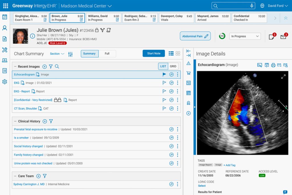
Patient Chart Summary
Clinicians had difficulty quickly accessing key patient information, which slowed workflows and increased the risk of errors. I designed a streamlined Patient Chart Summary that highlights the most important data in a clear, intuitive layout, making it easier to review patient details, and support faster, more accurate decisions.

Direct Messaging
Users previously had no way to export specific elements from the print chart summary, such as patient data or prescription details, into a messaging platform. To solve this, I designed a direct messaging module that lets users easily select and export chart elements with minimal effort. The intuitive, streamlined interface simplifies the workflow, enabling users to quickly and accurately share key patient information, improving communication and overall efficiency.

Allergy Module
The Add Allergy module, used to record patient allergies and their severity, was cumbersome and hard to use. I simplified it by streamlining content and controls, reducing clicks, and improving the visual hierarchy, making it easier and faster for users to input data accurately.

Print Module
Users needed an easy way to view and export data visualizations, like charts and reports, into a printable format, but the existing system lacked a streamlined solution. To address this, I designed the print chart feature, creating an interface that lets users seamlessly generate and format charts for both physical and digital reports.

Insights
Working on the EHR redesign was a real lesson in designing for high-stakes users. Clinicians need accuracy and speed, so simplifying complex workflows while keeping everything HIPAA-compliant was essential. I learned how valuable it is to get real-world feedback, presenting designs to doctors and nurses early helped me catch issues, validate assumptions, and make sure the interface actually worked for them. Working closely with other designers, PMs, and engineers showed me how important clear communication and shared documentation are when collaborating on a complex, enterprise system.
I also grew a lot in translating complex clinical requirements into intuitive, actionable interfaces. Balancing rapid iteration with regulatory and technical constraints taught me to be flexible and thoughtful in my decisions. Overall, this project strengthened my skills in systems thinking, user-centered design, and designing for complex workflows, while reminding me how crucial collaboration, compliance, and continuous feedback are when building tools that people rely on every day.